The Most Hated Internet Advertising Techniques
ADVERTISING IS AN integral part of the Web user experience: people repeatedly encounter ads as they surf the Web, whether they’re visiting the biggest portals, established newspapers, or tiny personal sites.
Most online advertising studies have focused on how successful ads are at driving traffic to the advertiser, using simple metrics such as click-through rates.
Unfortunately, most studies sorely neglect the user experience of online ads. As a result, sites that accept ads know little about how the ads affect their users and the degree to which problematic advertising tricks can undermine a site’s credibility. Likewise, advertisers don’t know if their reputations are degraded among the vast majority of users who don’t click their ads, but might well be annoyed by them.
Recent research by John Boyd from Yahoo! and Christian Rohrer from eBay is very telling . . .
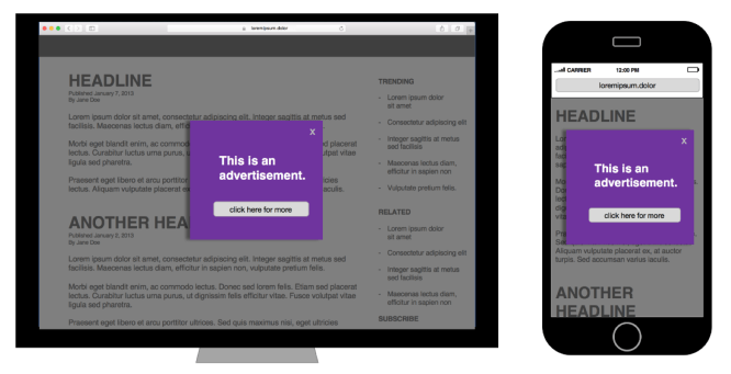
What’s Bad
When users were asked how various aspects of online ads affected their Web experience, they rated the following attributes most negatively.
|
Design Element |
Users Answering |
| Ads that pop-up in front of your window |
95% |
| Popup ads that load slowly |
94% |
| Popup ads that try to trick you into clicking on them |
94% |
| Popups that do not have a “Close” button |
93% |
| Popups that cover what you are trying to see |
93% |
| Popups that don’t say what they are for |
92% |
| Popup Ads that moves content around |
92% |
| Popup ads that occupy most of the page |
90% |
| Popup Ads and graphics that blink on and off |
87% |
| Popup Ads that float across the screen |
79% |
| Popup Ads that automatically play sound |
79% |
People often have strong negative visceral reactions to ads that commit the sins listed. One user, referring to an ad that automatically started playing audio, wrote: “IF ANYTHING COULD BE WORSE THAN POP-UPS, THIS IS IT. I HATE THIS AD. HATE HATE HATE.”
What’s Good
Not many ads are actively loved by users, but some advertising techniques do have a positive impact on the user experience. Users were particularly pleased with ads that clearly:
- indicate what will happen if people click on them,
- relate to what people are doing online,
- identify themselves as advertisements,
- present information about what they are advertising, and
- provide additional information without having to leave the page.
These design elements are tightly connected to traditional Web usability guidelines: make the users’ options clear, speak plainly, and provide the information users want.
Lessons for Websites
Small business websites can also learn from these studies, even if they don’t run ads. Many elements that users dislike in ad design are also common in mainstream Web design, with equally bad affects. A few things to avoid:
- Pop-ups
- Slow load times
- “Teasing” links, misleading categories, and other elements that trick users into clicking
- Content that doesn’t clearly state the site’s purpose or what a particular page covers
- Content that moves around the page
- Sound that plays automatically
All of these techniques have caused problems in traditional usability studies of non-advertising sites, and I’ve warned against them many times before. The fact that they’re associated with the most hated ads is one more reason that respectable sites should avoid them at all costs.
If you want to talk over these Get More Customers options, or the other effective tactics that I have, give me a call 0414 955 743 – advice is totally free of charge.
Cheers,
![]()
John